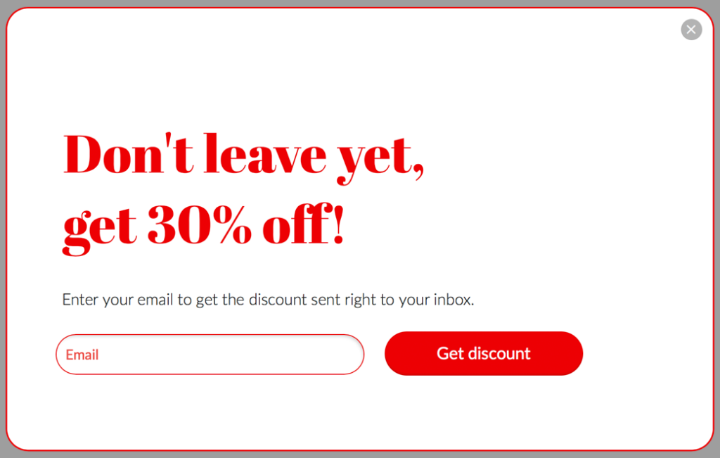
Exit intent popups are an effective way to capture the attention of website visitors who are about to leave your site. These popups are triggered when a user moves their cursor towards the top of the screen, indicating that they are about to navigate away from your site. By presenting a targeted message at this point, you can encourage users to stay on your site for longer or take a specific action before leaving.
However, creating an effective exit intent popup can be a tricky task. You don’t want to annoy your users with an intrusive message, but you also want to make sure that your message is clear and compelling enough to encourage them to stay.

In this blog post, we’ll explore some best practices for designing effective exit intent popups that can help you to achieve your goals without compromising on user experience.
One of the key principles of effective exit intent popup design is simplicity. You want your message to be clear and easy to understand, without overwhelming your users with too much information. Keep your message short and to the point, using simple language and a clear call-to-action.
The most effective exit intent popups provide value to the user. This could be in the form of a discount, a free resource, or access to exclusive content. By offering something of value, you give users a reason to stay on your site and engage further with your brand.
The timing of your exit intent popup is crucial. You want to make sure that your message is presented at a point where the user is most likely to engage with it. Typically, this means triggering your popup when a user has spent a certain amount of time on your site or when they are about to navigate away from a page that is key to your conversion funnel.
Like any design element, it’s important to test and iterate your exit intent popups to ensure that they are effective. This means experimenting with different messaging, calls-to-action, and timing to see what works best for your audience. Use A/B testing to compare different versions of your popup and track your results over time.
Your exit intent popup should be visually appealing and consistent with your brand identity. Use eye-catching graphics, clear typography, and a color scheme that is consistent with the rest of your site. Avoid using too many colors or fonts, as this can make your message harder to read and detract from the overall user experience.
Personalization is key to effective marketing, and exit intent popups are no exception. Use data about your users, such as their location, behavior on your site, or previous purchases, to create targeted messages that speak directly to their needs and interests.
While exit intent popups can be effective, it’s important to be respectful of your users’ experience. Avoid using aggressive language or tactics that may annoy or frustrate users, such as popups that are difficult to close or that appear too frequently. Make it clear how to dismiss the popup if the user is not interested, and ensure that it does not interfere with their ability to navigate your site.
Mobile devices account for a significant proportion of website traffic, so it’s important to ensure that your exit intent popup is optimized for mobile users. Use a responsive design that adapts to different screen sizes and ensure that your popup is easy to close on touchscreens.
In conclusion, designing effective exit intent popups is a valuable strategy for increasing engagement and conversions on your website. By following these best practices, you can create popups that provide value to your users, while still respecting their experience and avoiding annoyance. Remember to keep your message simple, provide value, and personalize your message. Timing is everything, so experiment with different triggers and calls-to-action to find the most effective approach for your audience. With these tips in mind, you can create effective exit intent popups that help to achieve your website goals while improving the overall user experience.